A Happy Thanksgiving?
First, make sure you have a SAFE Thanksgiving!
At Hero Digital, we want you to have the best holiday possible, because we are as caring as we are talented. But this can only be possible if you avoid the PERILS OF THANKSGIVING—a concept intentionally hidden by Big Turkey.
Throughout American history, we’ve routinely dismissed or outright ignored the treacherous moments that surround the 4th Thursday of every November.
That would all change in the fall of 1978—The Infamous Turkey Drop in Cincinnati


During “The Big Turkey Giveaway,” orchestrated by the struggling AM radio station WKRP, the “greatest event in turkey day history” became a scene of carnage for the history books.
A publicity stunt gone wrong
The idea was simple: drop live turkeys from a helicopter into the parking lot of the Pinedale Shopping Center. The result was simply horrific. Captured live from the scene, the nation will never forget the reporter’s cries amidst the panicking crowd, “THE TURKEYS ARE HITTING THE GROUND LIKE SACKS OF WET CEMENT!”
The public wanted answers. What they got was only a simple explanation.
“As God as my witness, I thought that turkeys could fly.”
–Arthur “Big Guy” Carlson, WKRP Radio Station Manager
The events from this day have all but vanished from our nation’s consciousness. And we know that those who do not learn history are doomed to repeat it.
It is in this spirit that we at Hero share our own Thanksgiving-gone-wrong experiences
Editor’s note: these brave souls have been kept (somewhat) anonymous for obvious reasons.
I had a client release their Black Friday sale EARLY and not tell me so I was half in the bag and their site was crashing. My wife calls it “the thanksgiving where you were screaming into the phone.”
—Christopher K, Chief Technology Officer
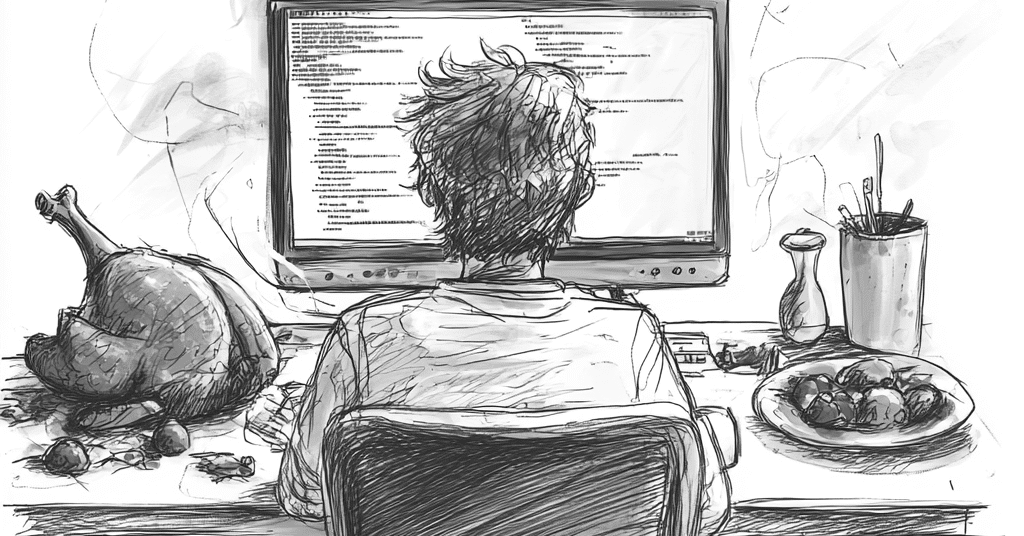

The first year they hosted, my aunt instructed my uncle to clean the turkey and found him upstairs with the bird in the bath tub scrubbing it with dishwashing detergent.
—Sean M, Director, Experience Technology


At my sister’s place in central MA. The power goes out maybe an hour after we put the bird in the oven. Stays out for several hours. Turkey went in the trash and we had dinner at a Chinese restaurant.
—Jerry N, Senior Technical Architect
One of the first times my step-grandmother came to visit, she wanted to make a good impression and brought a peanut butter pie. But she tripped on the sidewalk on the way into the house and the pie flipped right out of her hands. She was mortified.
Luckily, it was in a closed box, so we just salvaged the pie crust, scraped the filling off the box lid right back into the crust, and served it all the same.
—Eric S, Senior Business Analyst, Director of Hero’s Hero-Humor Slack Channel
My mom forgot the sugar in all the pies one year…
—Arielle M, Program Manager
…And my mother put salt instead of sugar into the sugar cookies…
—Willow M, Director, EX Business Partner
My son was born on Thanksgiving. We missed Thanksgiving dinner at The River Cafe in Brooklyn (NYC’ers will know it), but I did get a great kid out of it.
—Eric H, Copy Manager
When I was little, my mom made her amazing pumpkin pie and was carrying it to the dining room and tripped. The pie went flying across the room and hit not only the wall but also got all over our cat who was sleeping. I cried for over an hour because I thought my mom and cat were hurt.
—Jade V, Associate Resource Manager
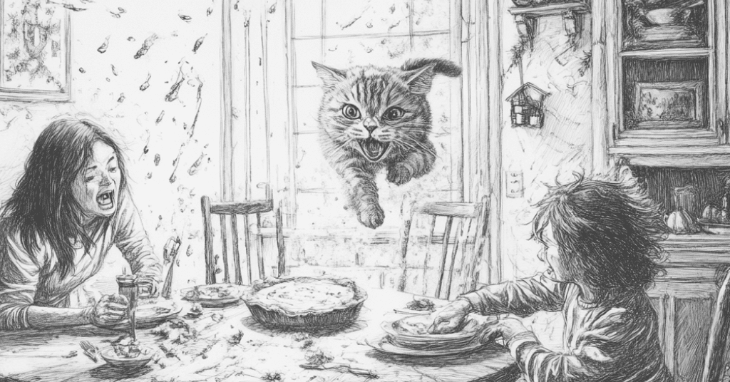

My parents will never stop telling the story of when a family member, using a stand mixer to make cranberry fluff, accidentally shredded a wooden spoon into it. There were wooden fibers in peoples’ teeth for hours apparently.
—Kevin S, Associate Director, Marketing Automation
My grandmother made the mashed potatoes with orange juice instead of milk. No one could say a word, as you do NOT complain in front of my Irish immigrant grandparents. My grandfather cleaned his plate while the rest of us just hid them under stuff.
—Bryan M, ACD
People learn from personal experiences
But we believe that we CAN also learn from the experiences of others. Please—learn from these stories, and whatever you do, do not deep-fry your turkey (we could do an entire article on those stories alone). With these lessons learned, and a well-considered seating chart, you just might have a HAPPY THANKSGIVING!
(And, remember, no matter how things go, your dinner will undoubtedly be better than that Feast of the Seven Fishes Christmas dinner in Season 2 of The Bear.)


How Atlantic Health Got its Governance Back
“Another flaw in the human character is that everybody wants to build and nobody wants to do maintenance.”
—Kurt Vonnegut
Governance is the most boring word in the English language. Governance isn’t cool, or hip, or innovative. And it’s rarely—in fact, never—thought of as a profit driver.
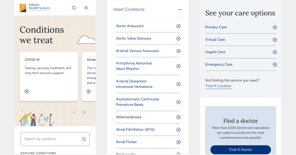
But for large organizations like Atlantic Health System (AHS) that prioritize the quality, consistency, and accuracy of information across their digital platforms, proper content governance isn’t something you can just leave to chance.

It’s Cool to be Consistent
AHS enlisted Hero Digital to help reimagine how they deliver healthcare content to their more than 7.5 million patients across 14 counties in New York and New Jersey. From information on conditions and treatments to data on locations and providers, their content needs to serve a wide variety of patients with vastly different sets of healthcare needs. And they need a way to ensure that all that content meets the rigorous editorial and content standards of their world-class brand.
To do that, we worked closely with the AHS web team to develop comprehensive editorial content, governance, and authoring documentation that included:
- A brand messaging framework
- Tone and voice guidelines
- Color, typography, and capitalization rules
- Detailed walkthroughs of each page type, including section-level goals, content considerations, and authoring guidance
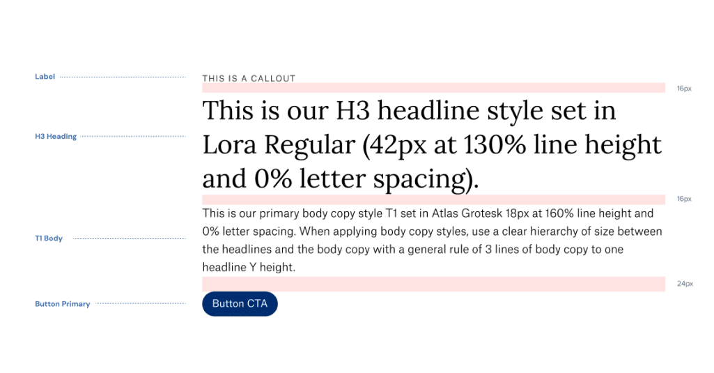

The content governance framework we developed helped streamline content creation, updates, and management, and it reduced errors and redundancies. It also supported better decision-making by providing clear content goals and guidance at a more granular level.
Content authors now have the tools to review their content against the latest best practices:
- Is the copy consistent with the AHS tone of voice and key messages?
- Is it formatted for scannability and comprehension?
- Does it meet the goals of the specific audience and situation?
- Does it take advantage of each component’s features and capabilities?
If so, then it’s good to go! If not, at least they have clear guidelines on how to bring the content up to AHS standards.
Governance is Good for the Bottom Line
Sure, effective content governance helps ensure legal and regulatory compliance and builds brand trust and credibility—but it also helps contribute to the bottom line. Because when you don’t have to spend time dealing with ad hoc content updates from disgruntled stakeholders or overworked healthcare providers, you can spend more time on the things that actually move the needle, like providing world-class healthcare to your patients.
And what’s cooler than that?

Creative Adventures in Photo Capture & Compositing
Editor’s note: Jeffrey Wright, whom we all know as Jedi Wright, is Hero’s Senior Content Strategist. His deep understanding of the nuances of information architecture guides our design. And, like all the folks in Hero’s creative department, he does some awesome stuff outside of work that deserves to be shared.
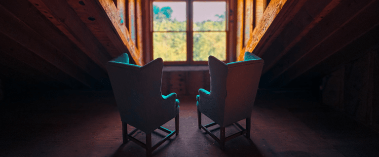
Photography has been my go-to creative visual outlet for years. I generally approach it spontaneously and outdoors, in and around nature.

I enjoy exploring the intersection of nature and artificial subject matter, frequently railways, architecture, and other fabricated/built environments.

Some common explorations often focus on and around juxtaposition, motion, tension, time, mood, and nostalgia.

I typically start from a place of emotion, mood, and energy to inform the medium and subject material. And much of my work is as subconscious as it is intentional.

As with my professional design work, I begin with rapid ideation, generating as many ideas as possible through divergence.

In my design thinking, “diverge” is the phase where I generate a wide array of ideas, exploring various possibilities without judgment.

“Converge” is narrowing down those ideas, critically evaluating them, and focusing on a specific theme, concept, and direction.

As with client work and outcomes, my creative outlet pays dividends for my health and well-being. It allows me to explore my creative ambitions and recharge for future work engagements, bringing fresh perspectives.

My current kit includes:
An iPhone Pro, Sony A7 IV Mirrorless with a Sony 28-70mm Lens Bundle + a Tamron 50-400mm f/4.5-6.3 Di III VC VXD Lens, and a DJI Mavic Pro 2.
See more of Jedi’s work on Instagram. https://www.instagram.com/jediwright


Design Systems: A Double-Edged Sword
Editor’s two cents: Tim Drabandt is a Hero’s hero, the creative director behind our own design system, Halifax. The following is an article Tim published for Creative Collisions, but it’s super-good (and important), and we want to make sure you get to see it, too.
In the ever-evolving world of digital design, we’ve witnessed a significant shift towards the adoption of design systems. These structured frameworks bring consistency and efficiency to the design process, streamlining workflows and ensuring cohesive user experiences across platforms. However, as we embrace these systems, we’re faced with an unintended challenge: the conformity of design.
Design systems, while solving many problems, have inadvertently created a new one. The push for reusable components and standardized patterns has resulted in a landscape where brands and products increasingly look and feel the same. As Lara Mendonça aptly puts it, “Unfortunately, conforming can be the key to success in tech.” This conformity, while efficient, threatens to stifle creativity and uniqueness in digital experiences.
The Tension Between Efficiency and Creativity
Those of us who grew up with the advent of the internet remember a time of wild experimentation in web design. From image map navigations to the innovative approach that the social network Path took with its UI, designers had the freedom to create truly unique experiences. Unbound by established conventions, this era arguably had a stronger brand presence with a more human touch.
Charles Eames once said, “Design depends largely on constraints.” While true, the constraints imposed by today’s design systems & scale are too rigid, limiting the potential for innovative and distinctive designs. The ROI of implementing design systems is so compelling for organizations that designers now have calculators to justify company-wide adoption. But at what cost to creativity & brand presence?
Breaking Free: The Power of Delight
To combat this creeping conformity, designers must focus on injecting delight into their work. This doesn’t mean abandoning the efficiency of design systems entirely, but rather finding ways to push their boundaries and infuse personality into standardized components.
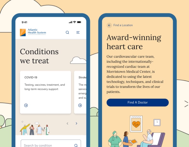
For example, at my current employer, Hero Digital, we recently helped Atlantic Health System launch a new website. As part of this effort, our client was intent on creating a stronger digital presence that spoke to the regional diversity of the Tristate area. Natalia Herrera, Associate Creative Director, worked with illustrator Rose Wong to create an illustration system that is fluid and ever-changing.
For example, the hero image of the homepage changes on each refresh, bringing in a refreshed look each time a visitor arrives on the site. By incorporating these randomized characters and abstract environments, they’ve created a digital experience that stands out in the often sterile, stock image-driven world of healthcare websites. This approach demonstrates that it’s possible to work within a system while still creating something unique and engaging.

Another stellar example is how Klarna, a buy-now-pay-later financial services company, expresses its brand vision. From motion to language, each detail is considered and thoughtful. Klarna has managed to create a brand expression that is incredibly rich, proving that conformity and creativity are not mutually exclusive. Even common patterns, such as a product listing page, feel familiar but distinctly different through the use of a minimal approach. By pushing the boundaries of their brand expression, their design system creates a distinctive visual language that sets them apart in the financial services space.
As conformity is setting in across all mediums, Mike Hugo from Studio Lowrie also reminds us that, “We also have sophisticated audiences that understand nuance. Creatives who can tap into that potential will keep making work that stretches the notion of brand building.” Hugo’s sentiment underscores the importance of brands taking risks and pushing the right boundaries.
Embracing Risk and Responsibility
As designers, we must remember our role as challengers of the status quo. Lara Mendonça eloquently states, “Accept your role as a designer, in the traditional sense of the discipline, as a challenger of the status quo. Our role should indeed be to question decisions made for us.”
This means taking calculated risks in design through implementation. While we shouldn’t go so far as to create unusable experiences, we should be willing to make investments in the new, and possibly, the future of design. By pushing the boundaries of what’s possible within design systems, we can create a sandbox that enables experiences to be both distinctive, memorable and efficient.
Embracing Elasticity: The Path to Innovation
In the face of increasingly bland experiences, we must remember that no risk means no reward. As designers, it’s our responsibility to question the status quo and push for innovation, especially within the constraints of what’s been defined. By focusing on delight, embracing creativity, and taking calculated risks, we can break free from the conformity trap and create digital experiences that are truly unique.
The future of design lies not in rigid adherence to systems but in our ability to bend and shape these systems to serve our creative vision. Let’s embrace this challenge and continue to push the boundaries of what’s possible in digital design.
You get the power of invisibility, but lose the ability to see in color. Do you take it?
Every month, we get together to discuss life’s most important questions. Share your thoughts on LinkedIn.