Well, looky here!
A healthcare website that isn’t meh.
Atlantichealth.org has launched: Part 1 of 3.
This is a big deal. For us, for Atlantic Health System, and for every single person who depends on them to be well.
But before we talk about us and how we feel and what we did, it’s crucial to lead with one totally cool point…
This was their idea
Atlantic Health System came to us, wanting to shift the perception of their brand—much more than a coat of fresh paint. Usually, we spend the first few weeks pushing for change. Rarely does a project of this scope begin that way.
Here’s the situation: digital healthcare desperately needs a reimagination based on equity. The entire industry knows this. Atlantic Health System knows this. And they had the courage to act on it.
“As with any digital transformation project, there were a lot of objectives. We were fortunate that Atlantic Health System was broadly aligned on why they wanted to differentiate,” said Tim, the project creative director. “Our primary goal was to connect with consumers emotionally and build trust.”
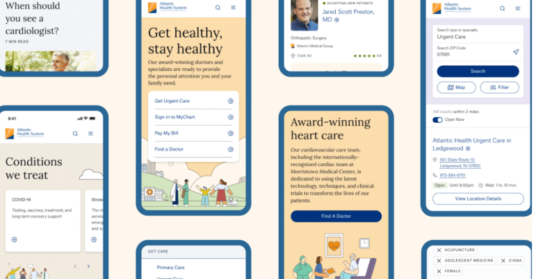

There’s a LOT we have to say, want to say, and will say about this launch
We’ll certainly be sharing the news across our social channels. But for us, the creative team, we really wanted to explain WHY this is such a big deal. And maybe HOW. Yeah, HOW, too.
Dozens of Heroes have worked very hard for a very long time to bring this to life. And for good reason—LOOK AT IT! That’s just not what big healthcare sites look like. (And that’s a very good thing!)
Explaining a big deal is also a big deal.
So, instead of one super-long article, we’re going to break it down into 3, giving our writers even more job security.
- Part 1: (this spiffy one right here) An Illustrated Approach
- Part 2: The Strength of Content Strategy
- Part 3: The Collaboration of Tech & Creative
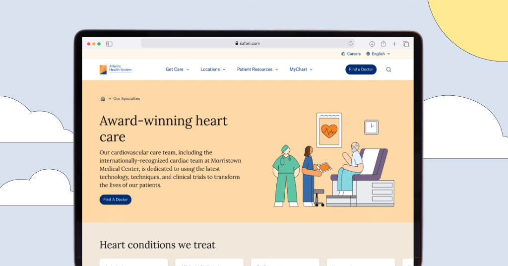

No. Stock. Photography.
OK, maybe a tiny little bit where a simple stock photo was more effective, but you get the point.
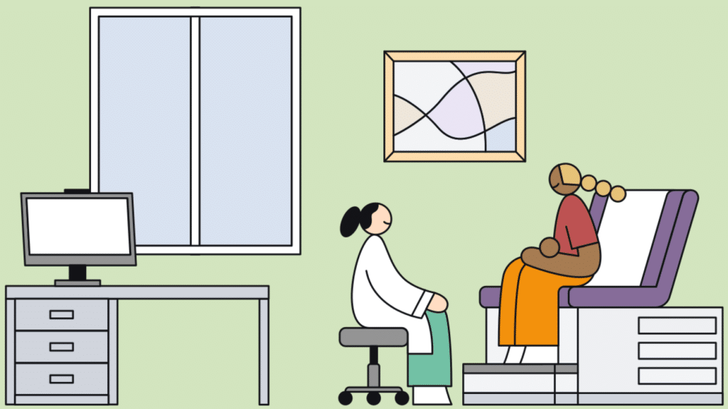
When we started to think about how to deliver diversity to Atlantic Health System, Natalia, our associate creative director, suggested collaborating with Rose Wong, a freelance artist.
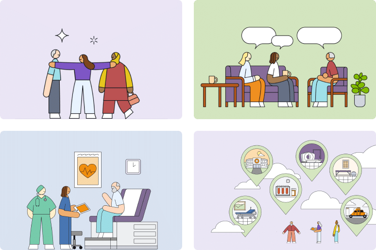
Rose’s clean, diverse and dynamic illustrations capture the people of the Atlantic Health System universe—people with lots of different body types, are pregnant, have mobility issues, are young, old, wear hijabs, and so much more—all represented throughout the digital journey with purpose.
With over 3 million combinations (some that will even wave at you upon page arrival), we’ve fully committed to ensuring that patients see themselves within the experience.
“Using custom illustrations allows us to connect with our audience in an authentic, joyful way by representing them, not talking at them,” said Natalia
“This approach also sidesteps the flawed stock image selection process and allows us to focus on the message,” said Natalia. “Right, we’re creating assets that are ownable, literally,” said Tim. The illustrations further brand differentiation and impact in the market. In a sea of sameness, those who choose to ‘zag’ command more attention.

Diversity isn’t “cool.” It’s crucial.
The inequities in our healthcare system—and their impact—are well-documented. As stated in a March 2024 joint statement issued by the Association of American Medical Colleges (AAMC) and several healthcare and medical organizations:
“…excellence in patient care which cannot exist until we have a physician workforce capable of caring for all patients and their needs holistically, and until the profession of medicine is accessible to all…”
Diversity within the healthcare industry is not about branding or marketing—it’s about better patient outcomes through action. The first action is simply representing all aspects of humanity, including our individual differences, to create an environment where these actions are welcomed.

A moment of thanks
“I feel proud of the work the team, Hero & Atlantic Health System, has accomplished and I am ready to work on the next phase of the launch!” said Tim.
“My first thought was gratitude for being part of a great team with our partners at Atlantic Health System, and the collaboration we enabled to lead to the final solution. I’m incredibly appreciative of how well our teams worked together, and how aligned we were on the final solution,” said Natalia.
We did it! We really did it!
We created an amazing, brand-shifting site with a tight-knit, cross-functional team, rock-solid content strategy, industry-leading technology, and an inclusive design that just rocks.
More to come with parts 2 & 3, which we promise will be worthy of your time.
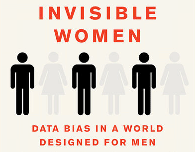

Are We Ignoring Half the Population?
Using data correctly is what we do
As a leading CX agency, Hero is committed to finding ways to use data to help our clients better serve the needs of their customers. But that commitment requires us to take a hard look at how we collect, analyze, and act on the data—always challenging our own assumptions and biases.
We asked two of our senior strategists to give their unfiltered reactions to Caroline Perez’s claim: gender bias in data collection can have adverse effects on women.
How effectively does Perez illustrate the real-world impact of gender-biased data on women’s lives?
Cheri (Director, Experience Strategy): Perez’s ability to show the far-reaching effects of leaving women out of consideration and research was astounding. Add the fact that her examples came from all over the world, we get a much clearer picture of the devastating effects of inconsideration of half of the world’s population. When only part of humanity is considered, how can everyone thrive
Andrew (Director, Content Strategy): To me, the most striking example of the real-world impact of the gender data gap is the lack of accounting for unpaid labor (e.g. childcare, household work, caregiving) that women typically do in addition to their paid work. While existing data seems to show that women start experiencing higher levels of mental and physical health issues when working paid overtime, the data doesn’t take into account the unpaid hours that women often put in on top of their official jobs. These additional hours have been shown to increase the likelihood of deadly conditions such as heart disease and cancer.
According to Perez, "gender neutral" decisions aren’t actually neutral. Why do these policies still end up favoring men?
Cheri Marone: Historically, data has been gathered by men, evaluated by men, and put into policy by men. What this means in the modern sense is that we have been, and continue to, collect data in the same ways we always have. The collection process does not ask the right questions to get a better set of answers. So when data-backed policies fail, we are surprised. How often do we stop and ask “was it the right data” and “did we ask the right questions to the right people”? AND, because I’m quite biased toward this, are we pursuing qualitative research to give the quantitative research context and depth? They are always stronger together. The WHY is always important.
Andrew Kaufman: Because policy-makers are focused solely on equality when they should be focused on equity. Giving everyone the same resources and expecting equal outcomes doesn’t take into consideration the fact that men and women often have very different needs and lived experiences. Designing for optimal outcomes means understanding the differences in how people interact with critical services in the real world, not just in a philosophical vacuum.
Did the book change your perspective on how data is used in decision-making processes?
Cheri: I don’t know that it changed my perspective rather than reinforced it. As an experience-strategy professional, two of my biggest take-aways were the importance of qualitative research in tandem with quantitative to get the whole picture and getting input from diverse sources. There were many, many examples in the book of quantitative research being done, making subsequent changes, and then those changes not having meaningful results, or short-term results, at best. If we are not asking why, and not asking different people, we will continue to struggle with solving community problems.
Andrew: Before reading this book, I tended to think of data as being inherently objective—that it reflected something true about the world. But Perez does a great job of showing how much data is influenced by how it’s collected, analyzed, and presented. What may seem objective at first, can actually be highly male-biased due to the deep-seated assumptions of culture and society.
Were there any surprising or unexpected findings in the book that challenged assumptions you previously held about gender equality?
Cheri: Nothing particularly unexpected, but one revelation I had was the significance of including a broad definition of user/participant when doing research. The idea of the book reinforced the idea that even when doing research about women, it must include women of all races, cultures, economic backgrounds, and identities.
Andrew: As someone whose job is acutely focused on words and how they influence people, it’s hard for me to admit that I’ve never fully appreciated how much gender bias is encoded into the English language. When she says that “male bias is so firmly embedded in our psyche that even genuinely gender-neutral words [like doctor or actor] are read as male” my first instinct is to argue that gender-neutrality should be the goal, right? It turns out that, in fact, languages that allow gender to be marked (e.g. female teacher, male nurse) are actually the most equal. As Perez eloquently states, “because men go without saying, it matters when women literally can’t get said at all.”
How do you think the book’s insights could influence future policies or practices in areas like healthcare, public planning, or technology?
Cheri: Real talk? I don’t think it will have a great influence on the future. The book was written by a woman about women. Given the way many cultures function, this in itself is dismissive. The author presents an abundance of evidence that including women in all aspects of design, research, and planning is good for everyone—but the fundamental ideas that women are “less than” AND need to fit the existing cultural norms must be changed first. This book was written in 2019 and I have yet to hear of any influence it’s had. Am I being impatient? Not looking in the right places? Completely possible. Maybe that’s the Gen-X in me.
Andrew: I would hope that decision-makers across all aspects of society use these insights to start collecting more data on gender—even in situations that would appear to be gender-neutral. I know that as someone who helps create digital products and experiences, we don’t look at gender data nearly enough when making decisions. But a lack of data shouldn’t be an excuse. If we really want to create things that work well for everyone, we need to actively work to close the data gap.
Any final thoughts or comments?
Cheri: As someone who works with data and uses it frequently, we always need to seek out the sources of research already conducted and religiously pursue diverse audiences when gathering data. This book has such broader implications than gender. We all need to consider this idea when trying to make sense of the world.
Andrew: I’m going to make sure that every Senior leader at Hero (including our CEO, Jay Dettling) has a copy of this book. As an agency, we talk a lot about empowering women and providing an inclusive environment for historically marginalized groups, and we need to put our money where our mouth is. If we don’t take this data bias seriously, then it’s all just lip service.
***
Editorial Note: Just this week, in the wake of the Hurricane Helene disaster, a public official very publicly claimed that “The people of Appalachia right now don’t give a function about tampons. They need water. They need to get out.” And, while he’s not wrong about needing water and access to safer locations, this is just another example of the invisibility of women. Without question, there is a not insignificant number of women in North Carolina and other parts of the south that have been devastated by Hurricane Helene who do, in fact, need tampons. The median household income in Appalachia today is $45K, almost 20% less than the national median household income. Period Poverty is a real thing and we should be talking about it. The need for menstruation products in times of emergency ranks among UNICEF’s top nine things we should know about menstruation. We change the world when we address everyone’s needs and we have the crucial conversations to inform and demand inclusivity.
Have you read any provocative takes on our industries? Send us your suggestions for books and article reviews. Get in touch.
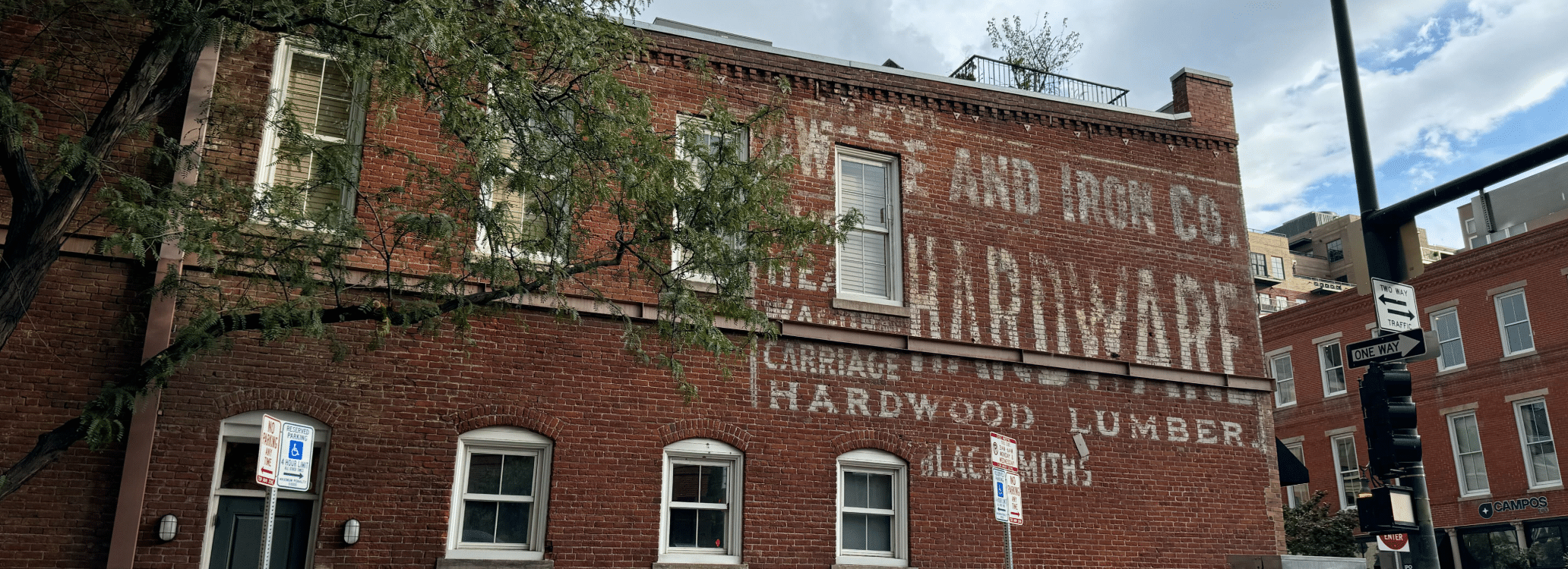

The Curious Type
Our random series that shares the distinctive ways that our creative team observes and interprets the world.
Ghost Signs: Portals into the Past
I often find inspiration in the layers of history that shape our environments. Among the most fascinating artifacts are ghost signs—those fading advertisements on brick walls that whisper stories of other eras. These remnants of the past serve as unexpected portals, allowing us to glimpse the cultural tapestry of a place and the evolution of its identity.
In a present dominated by slick digital interfaces and ephemeral content, ghost signs remind us of the power of permanence. Each peeling letter and faded hue tells a story not just about the products once sold but about the community that once thrived around them. Technology promotes instantaneity, ghost signs encourage reflection. As we design experiences in our increasingly digital world, we must remember the value of storytelling rooted in authenticity. Ghost signs remind us that behind every brand is a narrative waiting to be unearthed. They urge us to think about how our digital creations will age—will they withstand the test of time, or will they dissolve into digital noise?

How to dress like a Creative Director
Ah, the term “Creative Director.”
When you hear that phrase, don’t you just picture some tired old trope? A man—let’s face it, it’s almost always a man—over 50, sporting a beard and those ever-so-boring dark-rimmed glasses. Perhaps he’s bald, donning a serious expression like he’s just stepped out of a cliché. “I’ll stop wearing black when they make a darker color.” That could be Wednesday Addams, but no, it’s probably a Creative Director.
You’ve been conditioned to think this way. Not your fault—media and the very Creative Directors themselves have sculpted this narrative. It’s transcended “cool” and slipped into the realm of cliché. But if you truly wish to elevate your fashion game, darling, there are lessons to be unearthed here.
Do a quick stock photo search for “Creative Director.” Here, I’ll do it for you.
Behold the results:
- Overwhelmingly male.
- If a woman appears (a big “if”), she’s usually in her early 30s, looking like a corporate executive who has abandoned modeling in search of… something more creatively fulfilling. Picture her flicking a cigarette with a dismissive nod.
- And yes, they wear black—lots of it! Especially T-shirts and turtlenecks. Collect your bingo points for a bald, bearded man in a turtleneck.
- Scarves! Oh, the love of scarves! One would think Creative Directors must either be freezing or they all reside in Sweden.
- They are either impeccably groomed like news anchors or they look as though they’ve just rolled out from behind a gas station. There’s little middle ground.
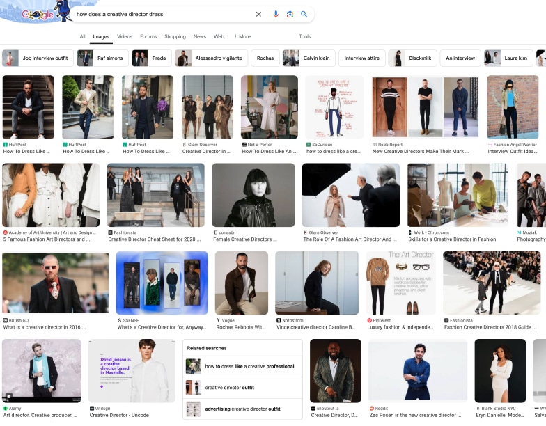

Amusing? Absolutely. But let’s not kid ourselves—Creative Directors are deliberate in their choices. While I may crave more tartans, zippers, and black leather jackets, I’m at least grateful clunky black boots still hold a place in their wardrobes. My work is not in vain.
So, we’ve dissected what the internet thinks about Creative Directors, and we understand the stereotypes swirling in your mind. But how do actual Creative Directors dress in the flesh? Have they somehow woven vantablack into their attire? Are they truly as cold and pretentious as they appear? Let’s meet a few Creative Directors from Hero Digital and uncover the truth (and a whole lot more)!
But first, as the trendiest ghost of an influential designer, I consulted the all-knowing ChatGPT on how one should dress as a Creative Director. The digital oracle offered this wisdom:
- Be stylish and trend-conscious. Embrace smart casual with an edge.
- Make bold, artistic, intentional choices.
- Play with colors and textures.
- Pay attention to detail; choose accessories with care.
- Be confident. Wear what empowers you.
- Invest in quality clothing that flatters your form.
- Professionalism isn’t just a suit; it’s about respect—toward your client and your team. Your wardrobe plays a crucial role.
This largely aligns with my own philosophy—fashion must be rebellious, thought-provoking, even political. Your attire should always be a statement. Creative Directors often excel at this, though I yearn for more rebellion and activism in their choices. Nevertheless, I appreciate their need to respect clients and employers.
Now, let’s meet some REAL Hero Digital Creative Directors and explore how they express themselves as genuine “creative professionals.”
Anthony, Associate Creative Director


Ah, a kindred spirit! Anthony boldly sports a mohawk—a true rebel. I applaud the authenticity of his style. Too often, the mohawk is merely a cry for attention from the uninspired. Not here. This is Anthony’s essence, day in and day out. And as a father, no less! Bravo, you artistic rockstar!
Yet… when asked to submit a photo, he chose a black T-shirt. Anthony, did you consult ChatGPT for wardrobe tips? Although I will admit that I appreciate the effort to draw all the attention to your mohawk. And, like your shirt, those glasses complement rather than compete. Just like his creative work, Anthony’s style is unapologetically true to himself.
Cheri, Director, Experience Strategy
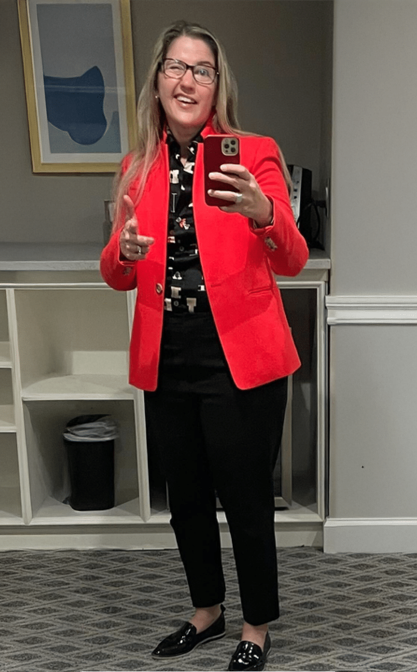

This was clearly put together to make an entrance! The bold red blazer says ‘I mean business,’ but the playful print beneath adds a cheeky twist—like she’s letting you know there’s more than meets the eye. Polished, yes. Perhaps a bit too shiny. But there’s no debate about the attitude—absolutely infectious! She’s got that ‘I’m here to get things done, but we’re going to have fun while doing it’ vibe, and I’m loving every bit of it.
Glossy loafers? On anyone else, NEVER. On you? Effortlessly cool—my dear, you OWN the room.
Natalia, Associate Creative Director
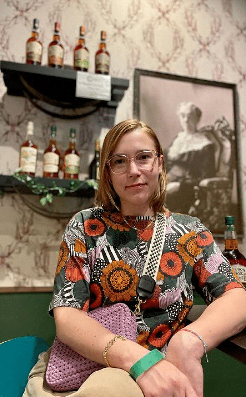

What’s not to adore about Natalia’s ensemble? She embraces bold tops that juxtapose flowers with stripes, anchored by a khaki skirt that makes us long for Jenna Lyons’ reign at J. Crew. (I know, not punk rock—but therein lies its punk spirit.) Her glasses serve a purpose, amplifying her daring look rather than overshadowing it. She fearlessly adds a belt bag of mixed textures and patterns, her confidence radiating as brightly as her creative work.
Bryan, Associate Creative Director
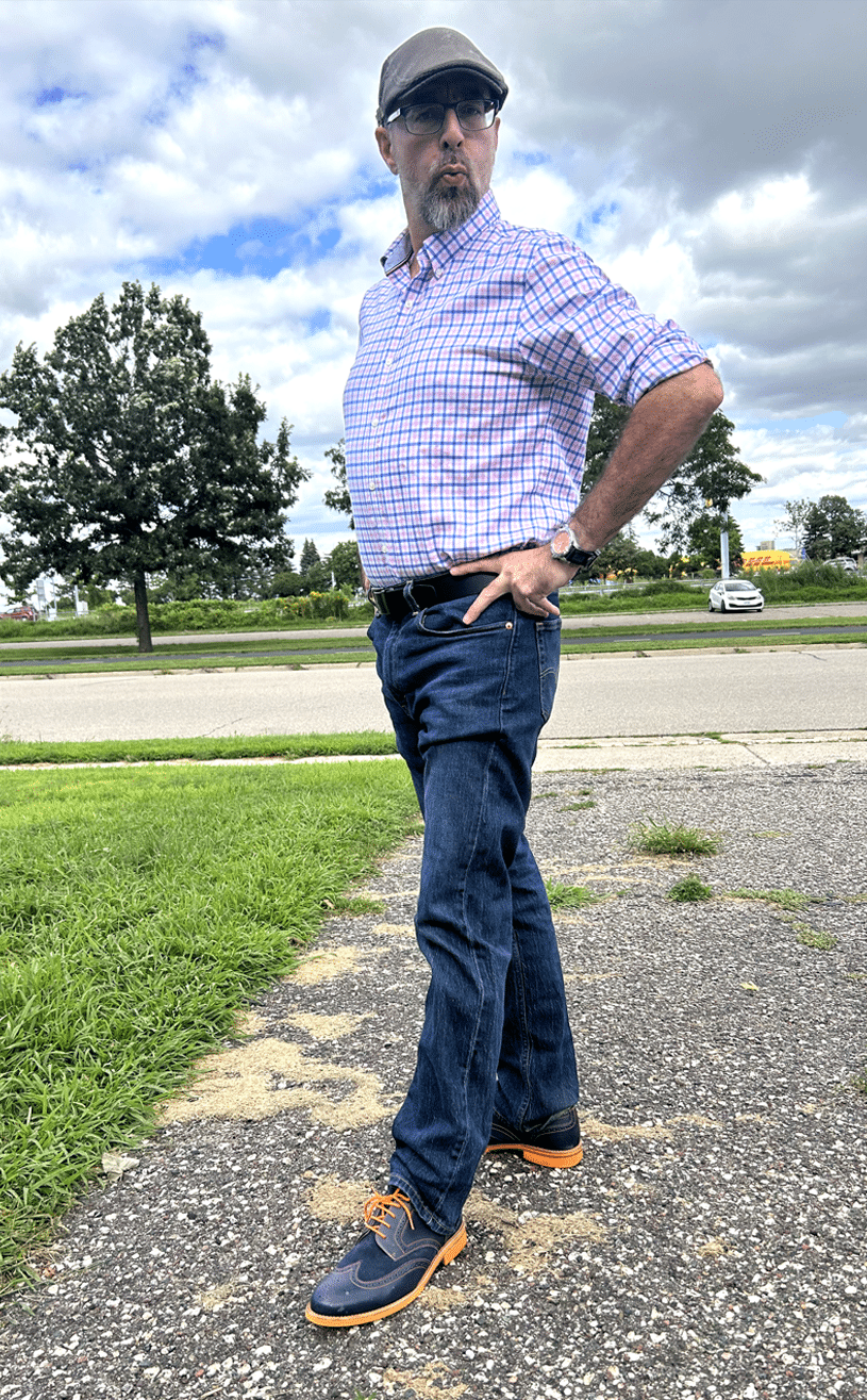

Looks like someone used that old gift card for a trip to the outlet mall.
Next!
David, Group Creative Director
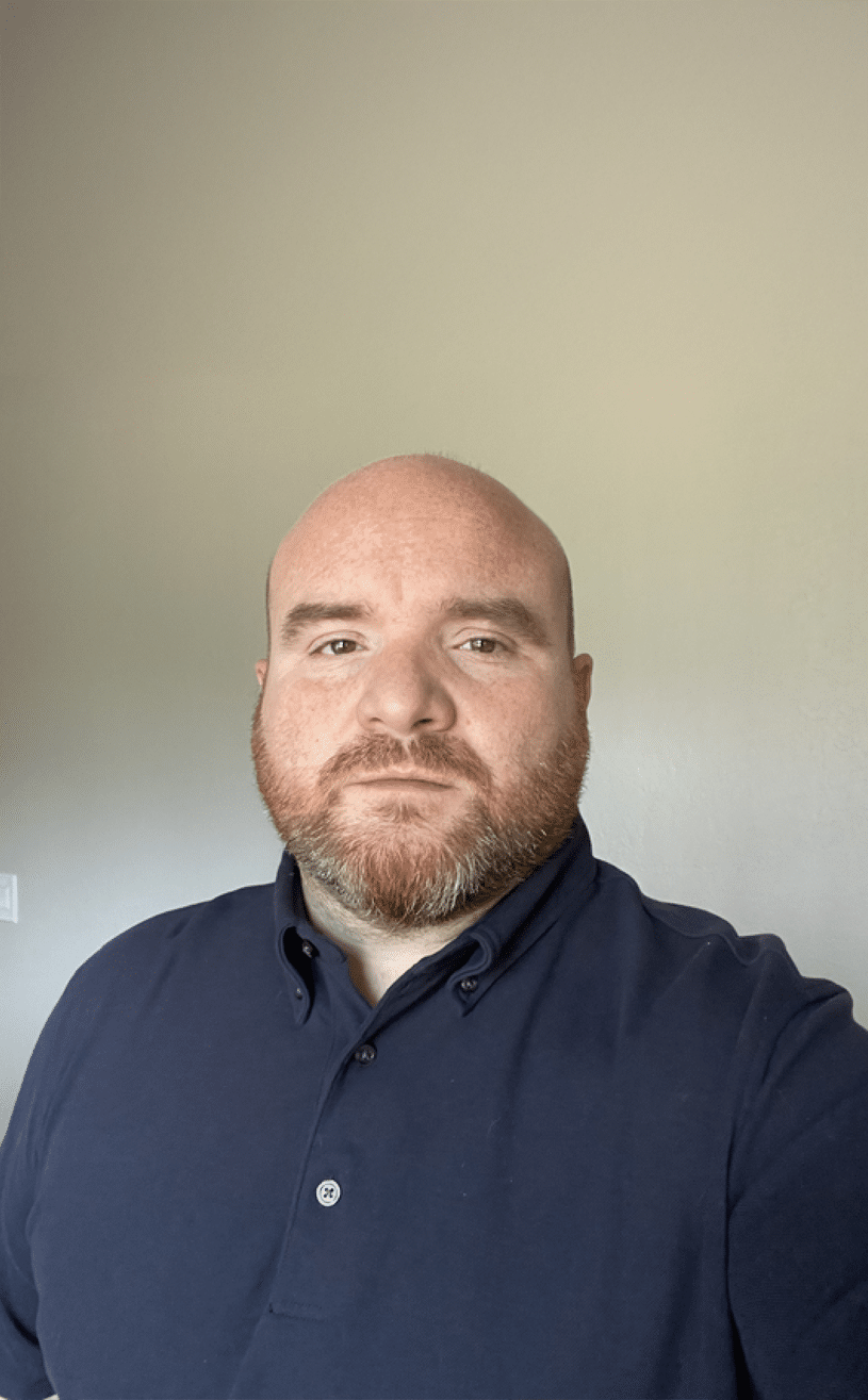

David teeters on the edge of stereotype, yet look closely—his shirt isn’t black; it’s NAVY. In a bold act, he flirts with Tory Burch’s ethos that black can be too harsh (preposterous, I know, but let’s indulge!). His conservative attire serves as a power play, proving confidence can shine without the reliance on black. And let’s not forget the juxtaposition of that buttoned-down polo. He’s teasing you, darling! Those eyes? They see into your soul, poised to answer your deepest creative desires. Tread carefully in this game of creative chicken!
Michelle, Executive Creative Director
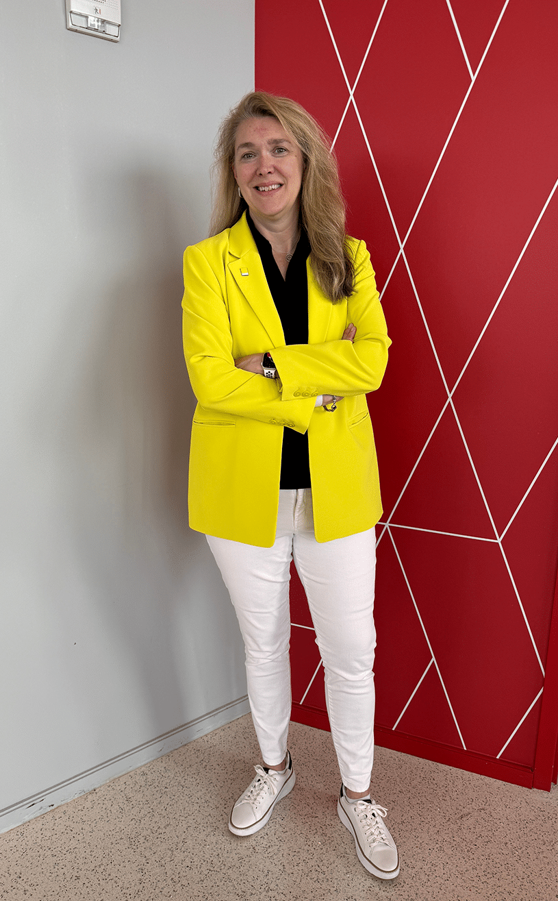

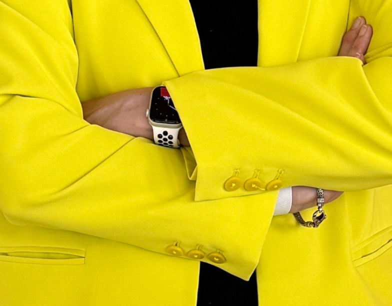
Oh, look. A (yawn) yellow blazer.
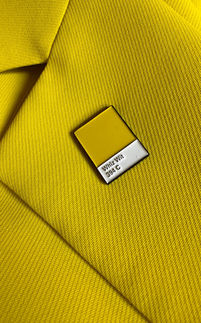

Wait…wait…upon closer look, we have a statement! No, a protest! A protest wrapped in an intellectual wink at all of us. Oh, darling, this is a delightful hint of pure genius. Let this be a lesson to us all—the mundane can become clever, even sly, with the smallest detail. One can wear a color with such precision that it transcends fashion. It’s not just a blazer; it’s a nod to design, a play on conformity, all while looking impossibly chic. I’ll even give those awful socks a pass. Clever girl.
We conclude this journey
So, dear ones, as we conclude this delightful journey through the wardrobes of these Creative Directors, remember that fashion should always provoke thought, ignite rebellion, and make an unapologetic statement! After all, we’re not just here to dress; we’re here to revolutionize!
Would you rather be able to fly two feet off the ground, or be able to breathe underwater?
Every month, we get together to discuss life’s most important questions. Share your thoughts on X.